Reframing, Refocusing, Reimagining Disability
Introduction
Reframing, Refocusing, Reimagining Disability engages with select artifacts from the Winterthur Museum & Library collections created by disabled makers, for disabled users, or about disabled people. Three thematic sections share stories about these works to prioritize the pride and ingenuity of disabled people who navigated and negotiated a world that often did not accommodate them.
This project emerged from our desire, as graduate students, to make the Winterthur Museum & Library’s collections more accessible with digital curation, visual and alt-text description, and a disability-centered interpretation. This effort was informed by disability scholars, activists and the field of Critical Disability Studies; therefore, some terms may be unfamiliar, and we will refer you to our Exhibit Glossary. Through this exhibition, we invite you to consider disability not as a limitation, but as a complex and often joyful aspect of life.
In fellowship with ongoing conversations in the field of Critical Disability Studies and grassroots disability justice initiatives, we recognize that this effort represents a step toward attending to decades of institutional exclusion and ableist scholarship that have often overlooked disabled histories and failed to make room for disabled people. We hope Reframing, Refocusing, Reimagining Disability fosters conversations about how access, inclusion, and disability histories are fundamental to the study of art and material culture.
Introduction text coauthored by Phoebe Caswell, Gabrielle Clement, Sandra James, Madeleine Ward-Schultz
|
A cautionary note on language Materials on display reflect the social mindset and perspectives of their time. Many of the words used in the past to describe disabled people and disabilities are offensive today. You will encounter some of these historic terms in the digital exhibition in the titles of artifacts and artworks, in the names of institutions, or in quotations from primary sources. As co-authors we have sought to restrict use of these terms to a minimum but want to alert those in the disability community for whom they may be harmful. |
Curators
This exhibition was co-curated and co-authored by graduate students enrolled in the “Disability and American Art Histories” seminar in the Department of Art History at the University of Delaware during the 2025 fall semester. Led by Dr. Jennifer Van Horn, and undertaken in partnership with Winterthur Museum & Library, graduate curators include: Phoebe Caswell, Gabrielle Clement, Sydney Collins, Sandra James, Cameron “Joey” Koo, Bella Lam, Sheng Ren, Julia Rinaudo, Lauren Teresi, and Madeleine Ward-Schultz.
Acknowledgments
We are indebted to our Advisory Council for the exhibition, who lent expertise and graciously shared their insights at multiple stages: Katherine Allen, Simon Bonenfant, Laurel Daen, Phillippa Pitts, and Patricia Maunder.
This exhibition project was made possible thanks to a grant from the Interdisciplinary Humanities Research Center at the University of Delaware, and undertaken in collaboration with Dr. Catharine Dann Roeber of Winterthur Academic Programs. We extend our gratitude to Jackie Killian and Chase Markee (Winterthur Academic Programs) for their support. Nicole Schnee (Manager, Digital Library Projects) has been an invaluable guide to navigating our digital home, Quartex. Finally, at Winterthur, our thanks to Eileen Scheck and Reggie Lynch (Interpretation and Engagement). Our work was shaped by generous guest lecturers and workshop sessions with Nicole Belolan, Leona Godin, Phillippa Pitts, Jaipreet Virdi, and Philly Touch Tours.
Reframing, Refocusing, Reimagining Disability
Section I: Creating Care
People living with disabilities experience care in many ways. Care can empower people and nurture meaningful connections and companionships. But care can also be restrictive and ableist when disabled people are not granted agency, consent, or individual choice. This first section, “Creating Care,” highlights the multiplicities of disability care across economic, social, and religious contexts. The design and use of assistive devices involved collaboration between disabled users, their communities, and skilled makers and craftspeople. Through these artifacts, we tell stories about embodied knowledge, intimate moments, and the close relationships that some disabled people experienced daily in the eighteenth and nineteenth centuries.
Coauthored by Gabrielle Clement, Cameron “Joey” Koo, Madeleine Ward-Schultz
Creating Care: Soothing Senses
Visual Description
This silver cup consists of a wide, cylindrical neck atop a stout, bulbous middle resting on a shallow base with cascading round-edged tiers. Affixed to the vessel is a long, slender, straw-like spout and, positioned at a right angle to it, a flat, wide, softly-beveled handle. Smooth and cool to the touch, the small mug-sized cup feels light but solid, with a slight imbalance between its bottom-heavy center and delicate handle. The shiny, reflective qualities of the cup’s spherical surface reveal the wavy, mirror-altered form of the photographer’s lower body.
Interpretation
Boston silversmith John Dixwell crafted this early eighteenth-century silver spout cup to serve a soft, runny, fortifying nourishment, such as posset, to infants, elders, and bed resting individuals.1 Posset was an eggnog-like beverage made with a milky base, sweetener, and alcohol that could be served warm or cold, alone or laced with medicine.2 Since the milk frequently curdled at warmer temperatures, the user would suck the sweetened liquid through the cup’s straw-like spout and spoon out the creamy solids from the wide opening.3
The user could easily drink from the ergonomically-designed cup with assistance or independently. Instead of having to obey a fixed dining routine mandating social etiquette and speeds of consumption, the cup’s user had the potential to set their own drinking pace and attend to their own comfort level.
Authored by Madeleine Ward-Schultz
Artifact Information
Spout Cup
John Dixwell
Boston, Massachusetts; about 1698–1725 Silver
3.9 in. (H) x 4.4 in. (L) x 4.7 in. (W)
1965.1357 Gift of Henry Francis du Pont
Footnotes
1 Iann M.G. Quimbly and Dianne Johnson, American Silver at Winterthur (Winterthur: The Henry Francis du Pont Winterthur Museum, 1995), 83-84.
2 Hannah Newton, “Inside the Sickchamber in Early Modern England: The Experience of Illness through Six Objects,” in The English Historical Review 136, no. 580 (June 2021): 548.
3 Anne Stobart, “‘The Danger Is Over’: News About the Sick,” in Household Medicine in Seventeenth-Century England (Bloomsbury Academic, 2016), 13-28.
Creating Care: Comfort
Visual Description
This adjustable, upholstered piece of furniture was designed to help someone sit up comfortably in bed, much like a “husband pillow” you can buy today. This historic bed-chair mimics the form of an early-nineteenth-century wingback chair with protruding arm and cheek rests. It has three distinct parts. Its rectangular backrest, which is 28 inches wide by 26 inches long, could accommodate the width of an adult person’s torso. If you touch the fragile blue-and-gold floral linen fabric that covers the backrest, you can feel the prickly horsehair fill within its upholstery. Two notched wooden rails and a hinged wooden flap work together to support the backrest and raise it to a user’s preferred angle. This manual ratcheting system functions much like a poolside deck chair. There are prominent stains on the backrest, right wing, and right armrest, as well as significant tears across the upholstery.
Interpretation
Bed-chairs were shared, communal objects in early America. For example, Philadelphia diarist Elizabeth Sandwith Drinker noted that she loaned her family’s bed-chair over 30 times to people in her Philadelphia community between 1777 and 1807.1 As adjustable furniture, bed-chairs supported the bodies of people who spent most or all their time in the warmth and comfort of their beds. Bed-chairs were likely operated by family members and caretakers, who were sometimes enslaved.2
Although we don’t know exactly who used this bed-chair in Winterthur's collection, the stains and wear that remain testify to its role as a supporter of both independence and community. The chairs’ armrests could alleviate the discomfort of holding heavy books, and a raised backrest could enhance a person’s experience with assisted eating.3 In an elevated seated position, a disabled person of an elite socio-economic class could appear presentable to friends, and other welcomed guests, reflecting period customs of “good posture” etiquette.
Authored by Gabrielle Clement
Artifact Information
Bed chair
Philadelphia, Pennsylvania; 1815-1835; Maple, tulip poplar, iron, horse hair, linen, cotton
26 in. (H) x 27.5 in. (W) x 21 in. (D)
1994.0069 Gift of Dr. Burton W. Pearl
Footnotes
1 Elizabeth Sandwith Drinker and Elaine Forman Crane ed., The Diary of Elizabeth Drinker (Northeastern Univ. Press, 1991).
2 There are two instances in which bed-chairs are mentioned in relation to enslavement. On January 18th, 1804, Drinker wrote in her diary, “A negro man brought home our bed-chair some days ago, he said that widow Osborn was dead.” In Virginia, an enslaver named Robert Beverley order two bed-chairs from London, one for himself and one for his aging father-in-law. Drinker and Crane ed., The Diary of Elizabeth Drinker, 122.; Letter from Robert Beverley to John Bland, Oct. 11, 1763, Robert Beverley Letterbook, 1761-1775, Library of Congress.
3 Sick Chamber Furniture,” in Mechanics Magazine vol 6, no.141-175 (1826), 28. Courtesy of Hathitrust.
Creating Comfort: On the Move
Visual Description
This Shaker walker is crafted from pieces of hardwood and assembled in a tripod construction. The handles resemble the form of a rolling pin, with two curved handles and a central median for ease of grip. The dowel legs connect to the base of the handles, and each leg is attached to an intersecting side stretcher at the mid-base for added support. There is an emphasis on balance in the walker’s composition for user stability, which aligns with Shaker visual and aesthetic orders of symmetry, simplicity, and utility. The walker’s surface has been painted a dark brown hue that emphasizes the organic pattern of the wood grain, and its body has gained a patina that creates unexpected moments of contrast across its surface.
Interpretation
This nineteenth-century walker reflects the craft and ingenuity of the Shaker community, known for their design and wooden crafts.1 The Shakers engineered a wide variety of assistive devices for elderly and disabled people.2 (Additional figure below) Their community emphasized religious devotion through mutual labor, fellowship, and ritual, and members contributed across life stages.3 Assistive devices like this walker enabled community members to continue participation in daily life. Belongings like the walker can be read as acts of crip technoscience and community ingenuity as they required shared knowledge, resources, and personal skill to craft.
Although the identity of the walker’s user is now unknown, their life is nevertheless engrained on the device’s surface. The walker retains contact marks from consistent grip, oil marks on the handles from daily work, and scratches on the legs from navigating the busy halls of Shaker communal dwelling houses. The object’s tripod form acted as a stable frame to rest against during worship or craft production, and for transitions from sitting to standing. The form and materiality of this walker emphasize the user’s commitment to community, personal agency, and devotion.
Authored by Cameron “Joey” Koo

Figure 1. Shaker walker and wheelchair
Photograph of Furniture pieces
Edward Deming Andrews, 1894-1964.; silver gelatin print
SA 0650 Edward Deming Andrews Memorial Shaker Collection, Winterthur Library.
Artifact Information
Walker
United States; 19th century Wood
Dimensions Unknown
Private Collection
Footnotes
1 Please note that the term Shakers is the contemporary name for the community known as the United Society of the Believers of Christ’s Second Appearing.
2 Many Shaker assistive devices like canes, proto-orthopedic shoes, walkers, cradles, and wheelchairs exist in the collection of the Shaker Museum (Chatham, New York). John T. Kirk, The Shaker World: Art, Life, Belief. (Harry N. Abrams, 1997), 110-11.
3 Merry B Post, “Medical Practice in the Harvard Shaker Church Family, 1834-1843,” American Communal Societies Quarterly 4, No 4. (October 2010): 218-22; M. Burks, “Faith, Form, Finish: Shaker Furniture in Context” in Shaker Design: Out of This World (Yale University Press, 2008), 34-35.
Section II: "Crip" Temporalities
How does disability impact one’s perceptions of time, of one’s future? In four artifacts, this second section, “‘Crip’ Temporalities," asks us to consider historical perceptions of time and aging. The concept of “crip time” from Critical Disability Studies, challenges the idea that all bodies, minds, and lives operate, change, and grow in the same linear stages. Similar to the re-appropriation of “queer” in the LGBTQIA+ community, some disabled activists and academics have embraced “crip” (from the derogatory word “cripple”) as both an identity and theoretical framework. “Cripping” encourages us to subvert ableist expectations of disability as a defect or medical condition that requires a “cure" and to, instead, celebrate and embrace diverse experiences of disability.
Coauthored by Gabrielle Clement, Sydney Collins, Sandra James, Bella Lam, Julia Rinaudo
"Crip" Temporalities: Casting an Age
Visual Description
Two separate ceramic figures stand about 7.5 inches tall. Small bits of gray hair peek out beneath their caps and around their hollowed cheeks. The woman leans slightly forward, supporting herself with a dark brown cane in her right hand. To her left, her male companion stands more precariously, placing weight on the cane in his left hand and on a long crutch tucked beneath his right armpit. Both figures pose on top of green mounds that sit flush against a shallow white pedestal with the word “age” painted across the front of each one.
Interpretation
The pair of small ceramic figurines stand apart, but their matching square plinths indicate that they have been in each other’s company since their creation in the early nineteenth century. Cast in molds, the elderly figures dressed for a cold day are likely part of a Staffordshire pottery’s series celebrating different life stages that include courtship, marriage, and sentimental scenes of childrearing and family life.1 Staffordshire ceramicists likely drew inspiration from “steps-of-life” prints popularized in Europe during this time. (Additional figure below) Such prints usually depicted a couple climbing a staircase which peaked at around 50 years and then descended into old age. Both of these cultural objects reflect European ideals of how time should shape the human body. However, this model of aging excludes the variety of debility experienced at any age. “Crip time” challenges this ableist view on aging, pointing out that the effects of time are not standardized nor linear.
Disability and illness have the power to extract us from linear, progressive time with its normative life stages and cast us into a wormhole of backward and forward acceleration, jerky stops and starts, tedious intervals and abrupt endings.
- Ellen Samuels, "Six Ways of Looking at Crip Time" 2
Authored by Sydney Collins
Figure 1. The Stages of Life, published by John Pitts
London, England; 1811 Hand-colored etching on paper
14.7 in. (H) x 18 in. (L)
1994,0619.14, British Museum
Artifact Information
Old Age Figures (Woman)
Staffordshire, England; 1815-1830 Earthenware (pearlware) with lead glaze
7.75 in. (H) x 3 in. (W) x 3 in. (D)
2002.0030.038.001 Gift of Thomas N. and A. Pat Bernard
Old Age Figures (Man)
Staffordshire, England; 1815-1830 Earthenware (pearlware) with lead glaze
7.9 in. (H) x 3 in. (W) x 3 in. (D)
2002.0030.038.002 Gift of Thomas N. and A. Pat Bernard
Footnotes
1 For more on the history of Staffordshire Pottery, Simeon Shaw, History of the Staffordshire Potteries. (New York: Praeger, 1970).
2 Ellen Samuels, “Six Ways of Looking at Crip Time,” Disability Studies Quarterly 37 (3) 2017.
"Crip" Temporalities: Creative Foundations
Visual Description
This 3x5-card-sized watercolor under a wide, white mat in a pale wood frame is of a chubby mouse, like one the artist would have encountered around his barn. The thin dark ink outline is filled-in with a warm solid brown color using brush strokes suggestive of coarse and matted fur. Painted in profile with one wide-open, upward glancing eye, two tiny, perked ears, and four ready paws, the feeling is anticipatory, as if the mouse is clever and poised to dart out of the wood frame. The tail curls playfully close to the edge of the paper that contains the creature and points to the hand-written title below, Long-haired Meadow Mouse Female, each word underlined with a wavy “flourish” through which are cut hash marks, giving the animal an air of importance not generally afforded a mouse. The picture transcends a straight-forward natural history illustration with the hint of the creature’s personality imbued by the artist.
Interpretation
The subject of this watercolor, a meadow mouse, is exactly what the ten-year-old deaf and nonverbal Amish artist, Henry Lapp, encountered around the barns where he was raised in late-nineteenth century Lancaster County, Pennsylvania. Lapp and his older sister Lizzie, also born deaf, loved to draw and paint with watercolors as children.1 This early praxis may have been influenced by imagery in fables, needlework, fraktur (a decorative and illuminated Pennsylvania German art form) and container labels. Their artistic abilities evolved in this time and allowed them to envision futures where they could participate in their community.
As an adult, Lapp made furniture and used drawing as the basis for a catalog of his pieces, helping him to communicate with customers. He also enjoyed making paintings to share with younger children in his community. His sister moved from painting to textiles, making and tailoring clothing and embroidering linens.2 The siblings’ early paintings were not discovered and collected until the 1970s due to the separatist nature of the Old Order Amish and unwritten rules discouraging art display and, in some cases, art making. These practices were seen as a potential threat to humility and, in the case of figurative art, a defiance of the second Commandment.3
Authored by Sandra James
Artifact Information
Long-haired Meadow Mouse Female Henry L. Lapp
Bird-In-Hand, Pennsylvania; 1872 Watercolor drawing on paper
4.8 in. (W) x 3 in. (H) unframed
2025.0009.002 A Gift of the Estate of Janice A. Egeland
Footnotes
1 Louise Stoltzfus, Two Amish Folk Artists: The Story of Henry Lapp and Barbara Ebersol. (Good Books, 1995).
2 Dainiel J. McCauley III, “The Paintings of Henry and Elizabeth Lapp”, Folk Art (Fall 1994).
3 George Bachman, The Old Order Amish of Lancaster County (The Pennsylvania German Society, 1961).
"Crip" Temporalities: Perceiving Womanhood
Visual Description
Two full-page illustrations of disabled women in the home. In the first, a languid figure sinks into a plump sofa, propped up by a wide, flat cushion. Her drooped, willowy hands and slumped posture show exhaustion. However, the woman’s tidy space, fine accessories, and fashionable dress match her serene expression, not a hair in her braided crown out of place. At her feet, an unkempt, high-spirited young girl with messy braids and rumpled clothes gazes in fascination. In the second image, the same young girl rests on plush pillows as five adoring younger siblings clamber around her bed to present their gifts. Across the girl’s body trails a silver bell on a string—a way to ring for help in case of pain—and on the right, a miniature Christmas tree adorned with round baubles stands atop a luxuriously upholstered, high-back, reclining, wooden wheelchair, all evidence of her family’s devoted care.
Interpretation
Artist Addie Ledyard’s pen-and-ink illustrations for author Susan Coolidge’s children’s fiction novel, What Katy Did, highlight a girl’s experiences with physical disability. Following a spinal injury, the unruly and adventurous tomboy, Katy, learns to care for her family and home as leaving her room is painful.1 In the first illustration, Ledyard depicts Katy with torn clothes and rough manner, admiring her Cousin Helen’s fine style and radical acceptance of her own disability. Helen’s clear weariness and isolation, however, strongly contrasts Katy’s comfort and vibrant spirit in the second image as her family surrounds her. In this familiar narrative of “overcoming” disability, Katy becomes a model woman, exceeding even the frail beauty she perceives in Helen, and ultimately learns to walk again.2
These two illustrations, and the novel as a whole, provide valuable representations of physically disabled women’s lives in the nineteenth-century American middle class. Equally important, however, is disability’s role as a narrative tool for Katy’s development into a “proper” woman.3 What Katy Did raises challenging questions about the intersection of disability and gender: What lives with disability are considered beautiful?4 How might people with physical disabilities be ethically and affirmingly represented? What futures are available to disabled women, and who decides?
Authored by Bella Lam
Artifact Information
What Katy Did
Susan Coolidge; with illustrations by Addie Ledyard
Boston: Little, Brown, and Company, 1899, 1872
4.7 in. (W) x 7 in. (H)
PZ7 C77w 1899 Printed Book and Periodical Collection, Winterthur Library
Footnotes
1 For more on Susan Coolidge and What Katy Did, see Susan Steinfurst, “What Katy Did by Susan Coolidge,” EBSCO, 2022, https://www.ebsco.com/research-starters/history/what-katy-did-susan-coolidge.
2 To read a digitized version of the first edition of What Katy Did with illustrations by Addie Ledyard, see the copy at the University of Pennsylvania digital library’s collection, “A Celebration of Women Writers”: https://digital.library.upenn.edu/women/coolidge/katy/katy.html.
3 Michelle Ann Abate, “The Tomboy Becomes a Cultural Phenomenon: Louisa May Alcott’s Little Women,” in Tomboys: A Literary and Cultural History. (Philadelphia, PA: Temple University Press, 2008): 24-49.
4 For more on beauty and disability in the late-nineteenth and early-twentieth centuries, see Susan M. Schweik, The Ugly Laws: Disability in Public (New York: NYU Press, 2009).
"Crip" Temporalities: A Stitch in Time
Visual Description
A white linen handkerchief with slightly warped edges, ebbing and flowing with the uneven stitches of the hem. The stitches are “whip stitches”, creating barely noticeable dots of string on the front side while securing the hem in a series of diagonal stitches on the back of the fabric. The stitches are done with two strings together, rather than the typical single thread. Vertical lines tinted rust brown with iron marks where it was once folded into neat squares. Other stains appear throughout- signs of wear over the years. A dab here, a wipe there, the life of the handkerchief recorded. Along the top edge carefully written in dark ink in flowing script it says: “Rebecca Smithies Senior. Made by her a short time before her death, while totally blind. She died 26 April 1827- Aged 81 years.”
Interpretation
Rebecca Smithies Senior hand stitched the hem of this linen handkerchief, finishing it in 1827. After her death that same year, someone inscribed her name, age, and date of death, stating that she finished the hem “when totally blind.” Until the mid-to-late nineteenth century, it was commonly expected that women have skills in hand sewing, which was taught both in schools and at home. This handkerchief is an example of “plain sewing”, the most essential set of skills which encompasses seaming, hemming, and the crafting of other simple garments.1 Pay attention to the pattern of the stitching, moving from the lower left outward. Although there are small inconsistencies in the size of the stitches that lead to the gentle curves along the perimeter of the fabric, a steady rhythm of motion reveals itself through the hands of its maker. (Additional figure below) Whether she was blind through the whole process of making or lost her vision while working on the handkerchief, Rebecca Smithies’s embodied knowledge guided her hand and her needle up, down, and around again through touch and experience. Today, we find her memory preserved not only in her stitches but in the words of someone who cared for her and her belonging and chose to memorialize her with an inscription.
Authored by Julia Rinaudo
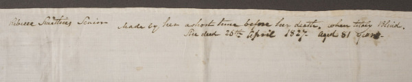
Figure 1. The upper portion of the handkerchief with full inscription stating, "Rebecca Smithies Senior. Made by her a short time before her death, while totally blind. She died 26 April 1827- Aged 81 years.”
Artifact Information
Handkerchief, hemmed by Rebecca Smithies
England; about 1827
Linen
18.75 in. (H) x 19.13 in (W)
2013.0048.031 Gift of Sandy Lerner
Footnote
1 Susan Burrows Swan, A Winterthur Guide to American Needlework (Henry Francis du Pont Winterthur Museum, 1976).
Section III: Negotiations
Mass-marketed everyday and decorative objects popularized public fascination with disability, complicating negotiations between whose demands and desires were seen. Yet, even the most mundane items—a book, a pair of tinted spectacle, a ceramic dish, and a newspaper—are sites of dialogue about institutional pride, d/Deaf and nonverbal education, performative displays of hearing, and the stigmas of displayed disability. The artifacts in this third and final section catered to able-bodied aesthetics, pandered to narratives of an ableist society, and rendered disability a problem to solve or curiosity to observe. However, by centering disabled users and makers, these four artifacts tell contrasting tales of challenges and victories during a period marked by shifting perceptions of disability’s place in society.
Coauthored by Phoebe Caswell, Sheng Ren, Lauren Teresi
Negotiations: Hearing Sign
Visual Description
A palm-sized children’s book opens, revealing delicate black and white engravings of costumed boys practicing British Sign Language. Each figure is framed by five signs of a single letter, striped ribbon, and abstract floral garlands. Turning to letter ‘S’, a child in a fur-lined coat and knight’s helmet holds a left fist over his right hand, interlocking his pinkie fingers to sign ‘S’. A hissing snake emerges from his helmet’s curling plume and playfully mimics the letter’s sound. Atop the page reads: “S, it is true, is apt to [hiss], But will not take our scheme [amiss].”
Interpretation
This early nineteenth-century British Sign Language manual was beautifully bound in once-bright red morocco goatskin, with blue and gray marbled boards and rich illustrations.1 (Additional figure below) Designed for “amusement and instruction,” the children’s book exemplifies early modern fascination with deafness.2 These engraved portraits of white, costumed boys signing letters suggest the book’s sign language tutorials were more digestible for an able-bodied society’s hunger for a taste of d/Deaf culture.
Engraver Charles Knight recasts deafness within a more familiar world of writing, surrounding figures with witty sound play, such as the child signing ‘S’ paired with a hissing snake. Author R.R.’s rhyming verses similarly amplify sound’s visual and auditory presence, warning that ‘S’ is “apt to [hiss],” a playful imitation, albeit inaccessible to d/Deaf readers. Yet, the spine’s handwritten label indicates previous ownership by a British “Deaf and Dumb” school, an outmoded identification, implying a history of d/Deaf use. Instructive or amusing, The Invited Alphabet did not sit idle. Opened, it falls apart, the worn-smooth cover detaching from the spine. Habitual handling unfolds in frayed, stained paper, pages loosened from bindings, and child-like graphite doodles to reveal an unspoken legacy of d/Deaf adaptation and, perhaps, self-identification.3
Authored by Lauren Teresi
Figure 1. Front cover of The Invited Alphabet
Artifact Information
The Invited Alphabet, or Address of A to B: Containing His Friendly Proposal for the Amusement and Instruction of Good Children
R.R. (author) and Charles Knight (engraver)
London, England: B. Tabart and Co., Juvenile and School Library, New Bond-Street, 1809.
5.3 in (H) x 4.7 in. (W)
PZ6 R7in, Rare Books Stacks, Winterthur Library
Footnotes
1 Unlike spoken British and American English, British Sign Language (BSL) and American Sign Language (ASL) are two mutually unintelligible languages with divergent origins, alphabets, and vocabularies. For more information on BSL, see Jordan Fenlon, Kearsy Cormier, Ramas Rentelis, Adam Schembri, Katherine Rowley, Robert Adam, and Bencie Woll’s BSL SignBank: A lexical database of British Sign Language (London: Deafness, Cognition and Language Research Centre, University College London, 2014) https://bslsignbank.ucl.ac.uk/.
2 For The Invited Alphabet, see “R.R., The Invited Alphabet,” The Hockliffe Project, accessed November 22, 2025, https://hockliffe.dmu.ac.uk/items/0696.html.
3 To read a digitized version of the Invited Alphabet, see the colored copy at Princeton University’s Cotsen Children's Library: https://dpul.princeton.edu/cotsen/catalog/37720h064.
Negotiation: Sight Refashioned
Visual Description
A small pair of silver-framed spectacles sits unfolded. Its lenses are small, oval, and tinted, coloring the world seen through them a shocking, icy blue. They connect via a thin, curved bridge for the nose, with two silver arms jutting from either side of the spectacles. The left arm bears the inscription “McALLISTER PHILADA.” Two strips of metal compose the arms, one sitting within the other on a rail, allowing for extension and retraction, so one might fit the pair snug behind the ears or tuck them into a breast pocket. At the end of each arm are teardrop-shaped holes, likely for hanging around the neck. The silver frame gleams, with only a hint of tarnish and its lenses lightly chipped where they meet the frames, reflecting the years of use.
Artifact Interpretation
Manufactured in the late eighteenth century by Philadelphia-based silversmith John McAllister, these spectacles would have been worn by a relatively wealthy individual; polished silver-framed spectacles with tinted lenses from the McAllisters cost upwards of five dollars at the time, nearly twice the yearly wage for the average laborer in the United States in this period. (Additional figure below)
The startling icy-blue lenses were conventional for individuals with weakening eyesight and those who spent much of their time straining their eyes. In this period, tinted lenses were believed to slow decline in vision and protect the wearer from the glare of lights. For much of the eighteenth century, spectacles were considered at once a fashion faux pas and a negatively viewed indicator of visual disability for those who could not afford the luxury object, yet a symbol of scholarly prowess for the upper echelon of society. During the nineteenth century, however, spectacles became accessible to the masses and more commonly worn by able-bodied people for protection from the sun. Today, tinted glasses are often worn as fashionable accessories, with their immediate association with disability fading from public consciousness.
Authored by Phoebe Caswell
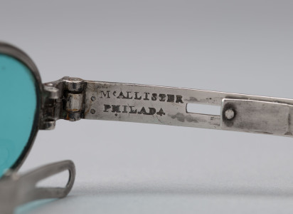
Figure 1. "McAllister Philada" maker's mark stamped on spectacles's silver left arm.
Artifact Information
Tinted Spectacles
John McAllister
Philadelphia, Pennsylvania; 1791-1830 Silver, Glass
4.5 in. (W)
1983.0244.009, Gift of Vincent H. Beckman in memory of Elizabeth Desloge Beckman
Negotiations: Placing Disability
Visual Description
This is an oval ceramic dish with a rim that rises and falls gently and a base that flares out of the body, forming soft waves, beneath which run a row of evenly spaced circular perforations. Using the transfer-printing technique, blue designs depict a series of scenes of buildings and spaces. The surface feels smooth and cool to the touch, the side walls are firm and thick, and several tiny glaze pops on the base feel like coarse grains of salt. When lightly tapped, the dish emits a short, muted tone.
Interpretative Text
This nineteenth-century blue and white transfer-printed ceramic vessel, likely intended to hold flowers or possibly food, was produced in Staffordshire, United Kingdom. The interior base depicts New York City’s Castle Garden, a bustling waterfront recreational space. (Additional figure below) One side of the exterior features the Deaf & Dumb Asylum, Hartford, Connecticut, which was a pivotal institution for Deaf education in nineteenth-century America that offered educational and residential facilities for the Deaf community. The other side depicts the New York Almshouse, which provided shelter and relief for the poor. This physical aggregation of spaces fostered a sense of identity and cultural pride among people with disabilities and their supporters.1
The choice of these three scenes as decoration was deliberate by British ceramic manufacturers at a time of postwar transatlantic trade recovery. Ceramic producers used these public buildings as symbols of “civilization” and “progress” to evoke pride among American consumers and reopen the American market. However, this commercially driven choice had its shortcomings, reducing disability educational institutions to mere decorative images on everyday consumer goods and obscuring the actual contributions schools made to the disabled community. Even while uplifting education and care, the one-sided portrayal of these buildings neglected the lives and culture of the disabled community.
Authored by Sheng Ren
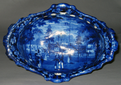
Figure 1. The interior base depicting New York City’s Castle Garden, a bustling waterfront recreational space.
Artifact Information
Dish: Esplanade and Castle Garden, NY; Deaf & Dumb Asylum, Hartford, CT; Almshouse, NY
Ralph Stevenson factory (Maker)
Cobridge, Staffordshire, England, United Kingdom; 1820–1825 Earthenware (pearlware); lead glaze
5 in. (H) × 10.25 in. (L) × 7.25 in. (W)
1958.1820 Bequest of Henry Francis du Pont
Footnotes
1 Ellouise Baker Larsen, American Historical Views on Staffordshire China, third edition (Dover Publications, 1979).; R. A. R. Edwards, Words Made Flesh: Nineteenth-Century Deaf Education and the Growth of Deaf Culture (New York University Press, 2012).
Negotiations: Institutional Community
Visual Description
This newspaper, titled The Mute and the Blind, was printed on April 13th, 1861, in what is now Niagara Falls, New York. The paper is crisp, and its uncut pages require careful unfolding. The front page features an elaborate masthead, the title section of a paper, complete with a floral border and two illustrations of well-dressed white men who are attentive students. The newspaper consists of articles on blind and deaf education, abolitionist poetry, and requests for donations to support the seven to nine Black students who attended the School for the Instruction of the Colored, Deaf, Dumb, and Blind in Niagara Falls. The last page of the newspaper includes a small rectangular illustration of seven Black children sitting before a white male instructor who points to a chalkboard that displays the phrase “There is a God.” Surrounding this central image are twenty-seven white hands demonstrating the complete ASL alphabet and the word “and.”
Interpretive Text
This issue of The Mute and the Blind was created by disabled students who attended the School for the Instruction of the Colored, Deaf, Dumb, and Blind in Niagara Falls, NY. The newspaper states, “The Editor is a blind man; the compositors are deaf and dumb; the presswork is performed by the blind; the papers are folded by the blind and wrapped by mutes.” Founded around 1858 by controversial educators and anti-slavery activists, Dr. Platt H. Skinner and his wife, Jarusha M. Hills, the school housed and instructed Black children who were blind, deaf, and/or nonverbal.1 Students learned American Sign Language and lived together in community. Unlike other American institutions in the Antebellum period, Dr. Skinner intentionally opened his school for disabled Black students.2 (Additional figure below)
Copies sold of The Mute and the Blind helped raise much-needed funds for the school. Throughout the newspaper, articles, poems, and illustrations pander to white abolitionists who commonly believed that education and Christian faith would lead to the “moral improvement” of enslaved people, the formerly enslaved, and children of color.3 (Additional figure below) Despite these racist views, The Mute and the Blind serves as a material reminder of a close-knit community of students who learned to read, communicate, and create together through disability-centered instruction.
Authored by Gabrielle Clement
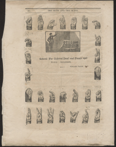
Figure 1. Back page page of The Mute and the Blind. Twenty-seven hands signing the alphabet and the word “and” in ASL frame a central illustration.
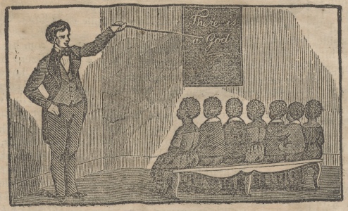
Figure 2. Detail of central illustration from the back page of The Mute and the Blind. Seven Black children sit in front of a white male instructor. The phrase, “There is a God,” is written on the chalkboard.
Artifact Information
The Mute and the Blind (newspaper), 13 April 1861
School for the Instruction of the Colored Deaf, Dumb and Blind, Niagara Falls, NY
3.5 in. (H) x 10 in. (W) folded
2025-163, Special Collectionn, Winterthur Library
Footnotes
1 Two of the students (Samual Stevinson, Nancy Smith) were blind, six were deaf (Jane Sly, Samuel Brown, Isaac Brown, Christian Heartwell, Hannah Polk, Elira Gilson), and one student (James Smith) was born blind, deaf, and nonverbal. In addition to Dr. Skinner and his wife, a 17 year-old blind white woman named Mary Smith also taught at the school. United States Census Record, 1860 (Niagara, New York). Michael Boston, “Dr. P.H. Kinner: Controversial Educator of the Deaf, Blind and Mute, and Niagara, New York Abolitionist,” in Afro-Americans in New York Life and History, Vol. 29, Iss. 2 (July 2005): 45.
2 Knapp, J. O.; McCall, A.; Bennet, Jos L., Report of Committee of Examination (Niagara City, July 30th, 1858), 8.
3 For more about abolitionist art see, Maurie D. McInnis, Slaves Waiting for Sale: Abolitionist Art and the American Slave Trade (Chicago University Press, 2011).
Conclusion
Thank you for taking the time to engage with this digital exhibition! If you would like to share your reflections or contribute your knowledge and personal stories, please complete this web form to tell us more. We are eager to hear from you!
It is our hope that this work encourages other institutions to reconsider their collections and approach interpretation through the field of disability studies. From mugs to handkerchiefs and eyeglasses, disability stories are everywhere in Winterthur Museum & Library’s collection and beyond. Importantly, these disability stories must also be accessible to guests and visitors, whether through a digital exhibition with visual description, a guided tour that supports tactile interactions with objects, or through new ideas and approaches that will continue to emerge as disabled people are welcomed to shape and re-shape museums. For further reading on disability studies and access, please consult our Exhibit Bibliography.
We are grateful to our Advisory Council, the Interdisciplinary Humanities Research Center at the University of Delaware, and Winterthur Museum & Library for making this exhibition possible.
Coauthored by Gabrielle Clement, Sandra James, and Jennifer Van Horn
Resources
Many terms, theories, and ideas in this exhibit were informed by disability scholars, activists, and the field of critical disability studies. As terms may be unfamiliar, we encourage you to refer to our Exhibition Glossary for definitions. You are welcome to reference this resource at any time.
For more information on the ideas and scholars that have inspired and informed this digital exhibit, please refer to our bibliography. This list highlights the rich and growing list of resources related to disability studies theory, materiality, and disability justice. Some of these resources are behind a paywall, but may be accessible through your local public library.